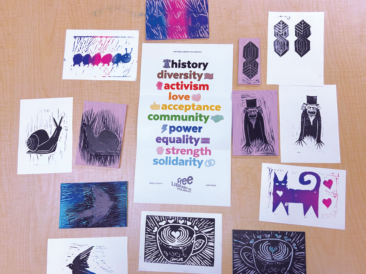
An act of creativity can be a freeing way to express myriad emotions surrounding our identities, and as such, they are a great way to celebrate Pride Month. Throughout June, the Free Library offers various creative workshops and events throughout the city, from nail art to printmaking.
I like to think of my identity as a continual act of creation. As I learn and grow, and find new influences, who I am morphs and re-forms. Gender and sexuality are a part of that. In her essay "Imitation and Gender Insubordination," Judith Butler wrote, “Gender is a kind of imitation for which there is no original.” Or in simpler terms from RuPaul’s signature phrasing, “We’re all born naked and the rest is drag.” With these ideas in mind, it makes sense that many queer people find an interest in the creative arts, from James Baldwin to local artist Bryn Ziegler. In the statement on her work Don’t Look Into the Abyss, Ziegler writes of queerness as "an ongoing journey propelled by a cycle of reflection."
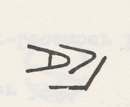
When deciding what to create, faced with a blank piece of paper (or nail!), it can be difficult to distill your essence and interests into a simple design that represents you. Master printmakers are familiar with this struggle; many have a design alongside their art called a "chop." A chop, like a signature, is used to sign an artist’s work or designate the print studio where the art was made. For example, the Tamarind Institute, a workshop formed in the 1960s to promote lithography (a form of printmaking), has its own chop.
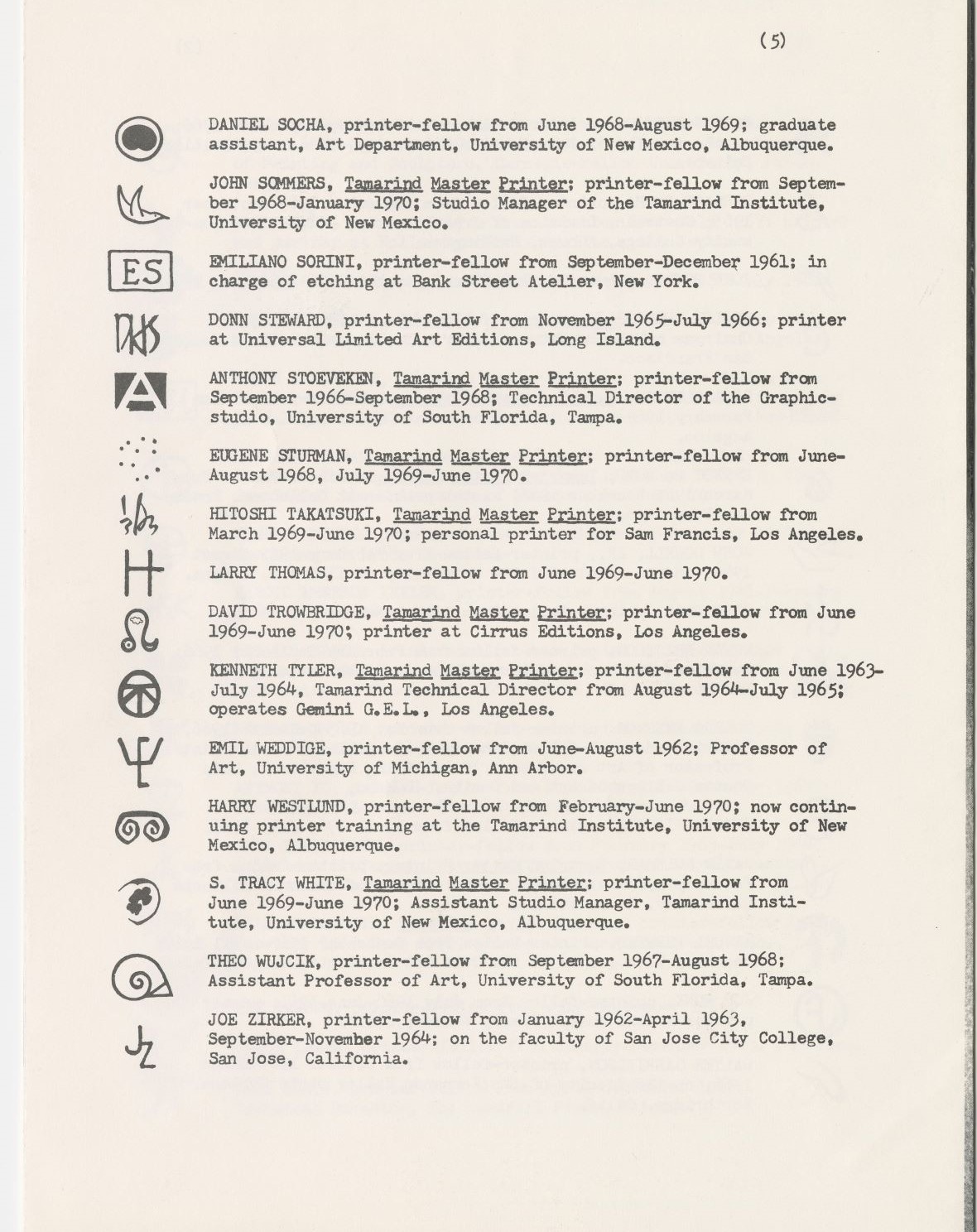
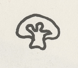
Works made there carry this chop, as well as the chop of the master printer who created it. Many artists, such as artist John Dowell, create a design that incorporates their initials or uses abstract lines. Others choose a more recognizable symbol, such as June Wayne, who used an adorable little mushroom to represent herself. These images are then embossed or stamped in ink onto each print created by the artist.
For queer people, there is a long history of needing to use symbols to represent themselves. When being gay or trans was not socially acceptable, even illegal, they needed ways to recognize one another safely. Oscar Wilde popularized the wearing of a dyed green carnation among dandies after a character in his play Lady Windermere’s Fan, and the flower, with its unnatural coloring, became associated with homosexuality — a love that is beautiful but was considered “unnatural” at the time. Similarly, violets are affiliated with lesbianism. This connection started with their use in poetry by Sappho, and grew even more in the late 1920s, after the premiere of Edouard Bourdet’s play, The Captive. The play, which featured two women in love exchanging violets, was controversial and some runs were shut down. Many women began to wear violets in support of the show.
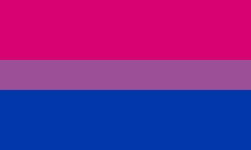
To make a design even simpler, color by itself can be a representation. Including the aforementioned violets, the color purple — especially lavender — has been associated with queerness. From the "lavender menace" slogan reclaimed by gay feminists to the lavender rhino used in advertising in the 1970s by the Gay Media Action group, queer history is saturated with the color. The color palettes of various Pride flags — like Gilbert Baker’s original rainbow flag or the blue, white, and pink of Monica Helm’s transgender flag — are easily recognizable. When the colors pink, purple, and blue were used together in movies, they were recognized by many internet users as Michael Page’s bisexual flag, leading to the creation of the term "bisexual lighting."

Even outside of explicitly queer symbols, color can also be a more personal, individual design choice. Philadelphia’s LOVE sculpture has grown to represent the city, but as with any art, it is filled with different meanings given to it both by viewers and the artist. The designer of the LOVE image, Robert Indiana, was a gay man. In an interview for The Association for Public Art’s Museum Without Walls: AUDIO project, Indiana revealed that the colors he chose for the original design — red, green, and blue — were inspired by the colors of his childhood. His father worked at a Phillips 66 gas station, and Robert recalls the scene of him and his mother picking up his father from work: “The gas pumps were red and green, the uniforms were red and green, the oil cans were red and green, and so it's the red and green Phillips 66 sign against the blue sky.”
Hopefully, these examples will give you some inspiration for your creations. The Print and Picture Collection at the Parkway Central Library holds a plethora of amazing art, including some of the artists mentioned above. Make an appointment to see Bryn Ziegler’s 18, 36, 27; works by Robert Indiana, or prints from a multitude of Tamarind Institute artists. The collection also includes work from more LGBTQIA+ printmakers, like Louise Fishman, Ellsworth Kelly, David Hockney, Kah Yangni, Rochelle Toner, and Ron Rumford. Even if you don’t have time to make an appointment, you can view the queer artists currently on display on the Second Floor — Twaze Deux by Didier William and various photos of Philadelphia by Harry Drasin will be up until June 22. And don’t miss the Andy Warhol print in the We Are What We Eat exhibition.
To find out more about the Print and Picture Collection, make an appointment.
To learn how to make your own print, using linoleum blocks or styrofoam, join us in one of the Pride printmaking workshops.
Join in one of the library’s other Pride Month workshops.
Happy creating and Happy Pride!
Have a question for Free Library staff? Please submit it to our Ask a Librarian page and receive a response within two business days.