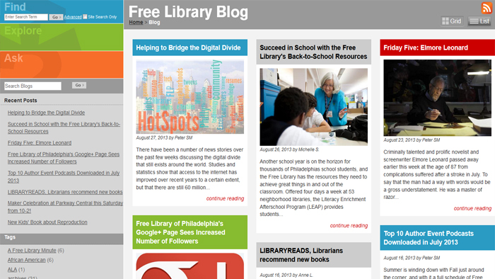
If you're looking at this blog, you may notice something different: more stories, more color, more pictures.
We've redesigned our blog!
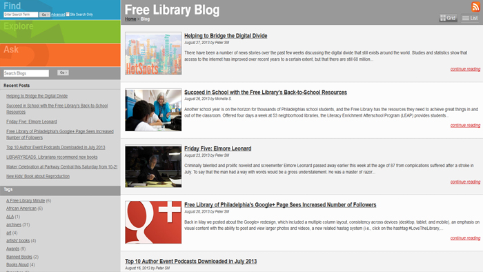
When you go to Free Library's blog now, you will notice two views available in the upper right-hand corner of the page: Grid and List.
The dynamic grid layout allows for multiple blog posts all in one viewing space, and the content resizes to a three, two, or one column layout depending on the size of your browser, allowing for compatability across all desktop computers, tablets, and mobile devices.

You can also view the blog in a familiar list-style layout.

Each layout view gives you a brief excerpt from the blog and a picture related to the blog post. You can then click on the title of the blog post or the "continue reading" link to read the full article.
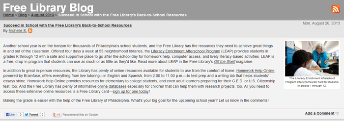
Once you've clicked on a post to read, you'll see that we've also added buttons for Facebook, Twitter, and Google+ at the bottom of each blog entry so that you can share Free Library blog posts with all of your social media connections.

Check out our new blog redesign, tell a friend via social media, and let us know what you think in the comments section!
Have a question for Free Library staff? Please submit it to our Ask a Librarian page and receive a response within two business days.

